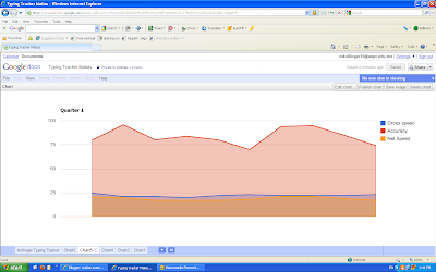
 This is a good representation because you can see on the sides the numbers and the colores of the lines. Then, the background below the lines are also very helpfull.
I like this chart because the line shows when and where I whent up and when I whent up. Also the colors are very helipful in identifing anything.
 I chose this chart because everything is arranged by date. Everything is together from the first day to the last day I took the tests.